On this page
Meta creative fails in a small number of predictable ways, and most of them are production decisions rather than strategy. Wrong ratio for the placement. One image cropped into four shapes. A refresh cadence nobody can afford to keep. This walks through each.
Last verified: 2026-08-17. Meta's placement specs are comparatively stable, unlike newer channels, but confirm against Meta's own documentation before a large build. LocalAds makes ad creative and does not place or manage ads.
The four shapes
| Placement | Ratio | Pixels | What to watch |
|---|---|---|---|
| Feed | 4:5 | 1080 x 1350 | The default for most spend, takes the most vertical space |
| Feed, square | 1:1 | 1080 x 1080 | Safer across placements, gives away height against 4:5 |
| Stories and Reels | 9:16 | 1080 x 1920 | Keep anything important clear of the top and bottom UI |
| Right column and search | 1.91:1 | 1200 x 628 | Small and cropped hard, keep the product central |
If you produce only one, produce 4:5. If you produce two, add 9:16. Square is the most portable asset but rarely the best performing one in feed.
Why cropping does not work
The tempting workflow is to shoot or generate once at the largest size and crop down. It is visibly worse, for a specific reason: the crop removes the parts of the frame you designed around.
Crop a 4:5 to 9:16 and you lose the sides, which is where product context usually sits. Crop it to 1.91:1 and you lose most of the height, which is where the headline and logo usually sit. What survives is a floating half-sentence and a product cut at the edge.
Compose per placement instead. Here is the same product built two ways:
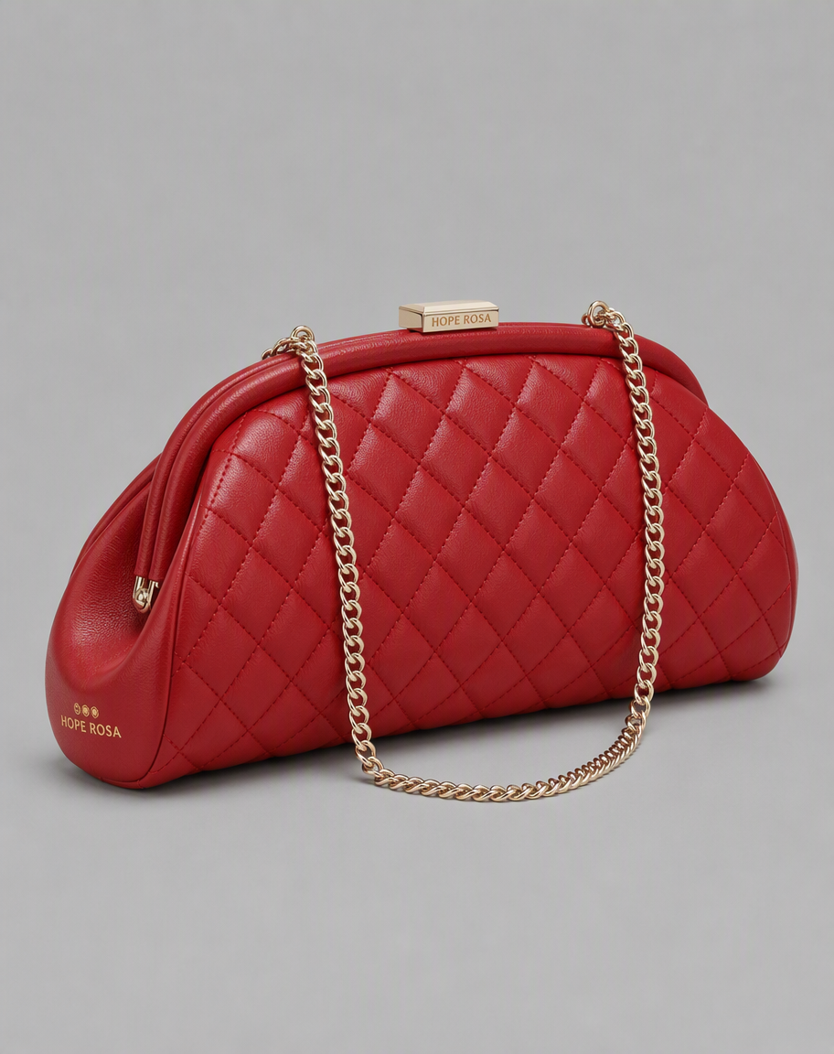
4:5 for feed. Vertical frame, product angled to fill the height, generous space above and below for the platform's own text furniture.
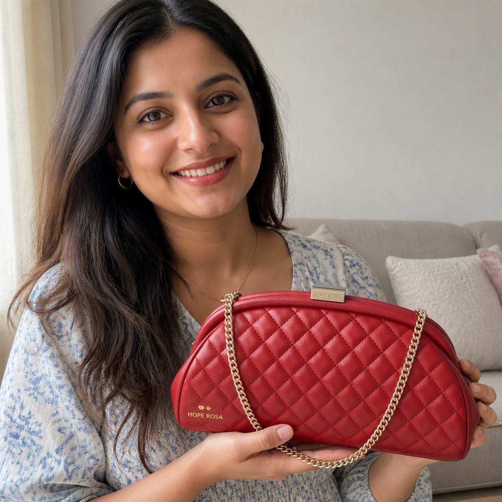
1:1 for square placements. Not the same photograph cropped. Different distance, different framing, product centred for a frame with no vertical room to spare.
The practical consequence is that a "placement set" is a set of compositions, and the cost of producing one is what determines whether you can actually run all four placements or quietly default to one.
How much text belongs on the image
More than people think, on Meta specifically. Feed creative competes with organic content, so a burnt-in headline, a price flash, or a badge earns its place in a way it does not on other channels.
Two caveats worth keeping:
Keep it legible on a phone. Most impressions are mobile and small. If your headline needs more than a glance, it is too long.
Do not carry the habit to other placements. A Meta static built around a headline is actively wrong in a ChatGPT Sponsored card, which supplies its own title and copy fields and renders around 512 pixels. That comparison is worth understanding before you reuse assets across channels: ChatGPT ads vs Meta ads vs Google Ads.
Fatigue is a volume problem
Every account eventually sees the same pattern: frequency climbs, CTR decays, CPA drifts up, and nothing about the targeting changed. That is creative fatigue, and the mechanics are covered in why your Meta ads stopped converting.
What is worth saying here is narrower. Almost everyone running meaningful spend knows their creative is stale. The reason it stays stale is that producing the next set costs a shoot, a designer, or both. The refresh cadence you can sustain is set by production cost, not by strategy.
Which is why an angle set matters more than a single hero image:
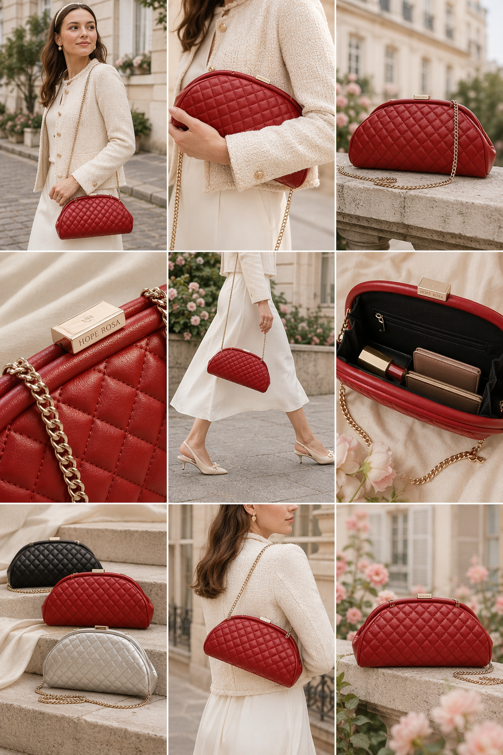
Nine angles on one product: street style, hardware detail, the interior, the colourway lineup, worn crossbody, product alone. Each is a different claim, which means each can be a different ad rather than the same ad recoloured.
A testing order that tells you something
The common mistake is changing several things and learning nothing.
1. Test the angle first. The claim you lead with moves performance more than any execution detail. Product-alone versus in-use versus colourway comparison are three different arguments.
2. Then the format. Static against video, carousel against single image, within the winning angle.
3. Then the execution. Crop, colour, headline wording. Real but smaller effects, worth testing only once the angle is settled.
4. Copy last, and separately. Primary text has roughly 125 characters before truncation and a headline around 27 to 40. Change it on its own, not alongside a new image, or you cannot attribute the result.
Two rules that save time: change one variable at a time, and give each variant enough spend to leave noise behind. Most "inconclusive" tests were underfunded rather than genuinely inconclusive.
Where LocalAds fits
LocalAds turns a product URL into a placement set: 4:5, 9:16, and 1:1 composed separately rather than cropped, generated from your real product page so packaging, colours, and details stay accurate. Every image in this post is unedited output.
We do not place ads, manage campaigns, or need access to your ad account, and we are not a Meta partner. We make the files you upload.
FAQ
What size should Meta ad creative be? 4:5 at 1080 x 1350 pixels for feed, 9:16 at 1080 x 1920 for Stories and Reels, 1:1 at 1080 x 1080 for square placements, and 1.91:1 at 1200 x 628 for right column and search. If you only produce one, make it 4:5, since that is where most spend goes.
Can I crop one image for every Meta placement? You can, and it usually shows. Cropping removes the parts of the frame the composition was built around: the sides going to 9:16, most of the height going to 1.91:1. Headlines end up clipped and products cut at the edge. Separate compositions per placement perform better.
How much text should be on a Meta ad image? More than on most other placements. Feed creative competes with organic content, so a burnt-in headline or badge often earns its place, provided it stays legible on a phone. Do not carry that habit to a ChatGPT Sponsored card, which supplies its own text fields and renders far smaller.
How often should I refresh Meta creative? When frequency climbs and CTR decays rather than on a fixed schedule, though accounts with meaningful spend typically need new angles every few weeks. The real constraint is production cost, because a cadence you cannot afford is not a cadence.
What should I test first in Meta creative? The angle, meaning the claim you lead with, since it moves performance more than execution details. Then format, then execution, then copy on its own. Change one variable at a time and fund each variant enough to clear noise.
What is the difference between Meta ad creative and ChatGPT ad creative? Ratio and text. Meta favours 4:5 and 9:16 and rewards headlines burnt into the image; ChatGPT accepts only 1:1 and expects a clean image because the card provides its own title and copy fields. A Meta static dropped into a ChatGPT card is the wrong shape and duplicates text that already exists.
The takeaway
Produce per placement rather than cropping, put the text where the platform rewards it, and treat your refresh cadence as a production budget rather than a good intention. Then test the angle before you test anything else, because that is the variable that actually moves.
Related reading: