On this page
The short answer. "Ugly ads" are paid social ads that look like ordinary phone content instead of a commercial: handheld, natural light, imperfect audio, plain captions, no brand-book polish. They often beat polished creative because the first two seconds decide whether anyone watches, and an ad that looks like the posts around it does not trigger the scroll reflex that a glossy ad does. Ugly is not the same as bad, though. A good ugly ad is rough in production and ruthless in clarity: one problem, one product, one visible result.
Here are two ads for the same copper water bottle, both rendered by LocalAds. On the left, a deliberately rough phone-style ad. On the right, a polished product film. Neither is wrong, but they do completely different jobs in a feed.
Where the idea comes from
The phrase was popularised by growth advisor Barry Hott, whose argument is simple: viewers judge an ad in a moment, feeds are full of casual phone footage, and polished ads stand out as ads and get skipped (Practical Ecommerce). By early 2024 DTC brands were openly building "ugly" into their creative mix, with Hott blaming strict brand guidelines for making so many ads look the same (Modern Retail).
Two honest caveats. First, there is no controlled study showing ugly ads beat polished ones across the board; the evidence is practitioner experience and individual account results. Second, the brands that win with ugly ads test a lot of them. One brand in the Modern Retail piece reported that roughly 10 to 20 percent of its weekly new creative worked. Ugly is a cheap way to run more tests, not a guarantee.
What an ugly ad looks like
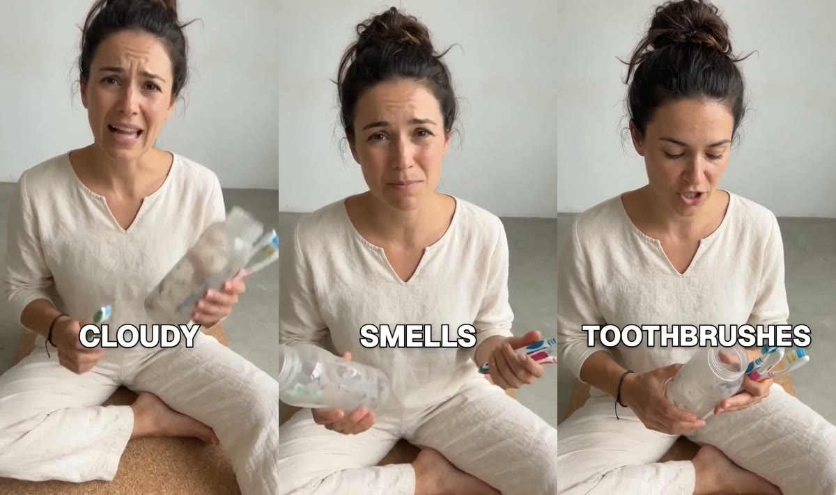
This is LocalAds' Deliberately Rough AI format. It is a four-second loop from a roughly 20-second ad.
Bare wall, floor, natural light, a person mid-complaint. Nothing about the frame says "ad", which is exactly why it gets the next two seconds.
The opening shots do one thing: show the problem with the usual fix failing. The bottle is cloudy, it smells, and scrubbing it with toothbrushes has not worked.
Then the product is held right up to the lens, used immediately, and the result is instant and obvious. That is the whole ad.
The rules that separate ugly from bad
| Rule | Ugly (good) | Bad |
|---|---|---|
| Hook | The problem, visible in the first 2 seconds | A logo, a slow intro, a person saying hello |
| Production | Handheld, natural light, real room | Blurry product, unreadable label |
| Message | One problem, one product, one result | A list of features |
| The product | Held close to the lens, fills the frame | Small, half off-screen, never named |
| Result | Instant and exaggerated, like a satisfying before and after | Implied, or "results may vary" with nothing shown |
| Length | 15 to 30 seconds, quick shots | A slow build that never pays off |
| Captions | Plain, word-by-word, readable on mute | Branded fonts and colour bars |
The pattern is that everything around the product is rough, and the product itself is not. The label, the colour and the result must be unmistakable, because the viewer gives you no time to work them out.
Ugly vs polished: when each wins
Polished creative still has a job. It just is not usually the first-touch job on Reels and TikTok.
The polished version: a premium storyboard commercial. Beautiful, and it reads instantly as an ad.
| Situation | Lean ugly | Lean polished |
|---|---|---|
| Cold audiences on Reels, TikTok, Shorts | Yes | Rarely |
| Retargeting people who visited the site | Sometimes | Yes, it reassures |
| Premium or luxury positioning | Carefully | Yes |
| Products with an instant visible result | Yes | Either |
| Launches and brand moments | No | Yes |
| Creative testing on a small budget | Yes, cheap to make many | Expensive per test |
The best accounts run both: rough ads to find the angle that converts, polished ads to scale it where brand matters.
Other formats that borrow the same idea
"Ugly" is one end of a spectrum of native-looking formats. These three share its instinct: look like content, not a commercial.
UGC talking head. A person reviewing the product to their phone camera. Less chaotic than a rough ad, and built on trust rather than an instant result.
Before / after. The same place filmed before and after the product, ideally in one continuous shot from the same camera so the change is believable.
Absurd hook. Something impossible, filmed as if it were real. Not ugly at all, but it uses the same trick of not looking like an ad in the first second.
For the full set of twenty, see video ad formats that work in 2026.
Can AI make ugly ads? Yes, and it should say so
There is something slightly absurd about using AI to imitate cheap phone footage, and the format leans into it: LocalAds' version is openly AI-made. That matters for two reasons.
- Do not pass AI off as a real customer. An ugly ad that pretends a real person filmed a real result crosses from native into deceptive. Platforms label or require disclosure for realistic AI-generated people in ads (Meta), and the US FTC treats fake testimonials as deceptive (FTC rule on fake reviews and testimonials).
- Keep the result honest. "Exaggerated" means visually clear, not a claim the product cannot back. If the bottle does not clean itself, the ad cannot show it cleaning itself.
How to make a rough AI ad in LocalAds
You pick who the ad is for (audiences are written from your product page) and the Deliberately Rough AI format. LocalAds writes three short stories around one problem, one product and one result, then the script and the cast. You read every line, change any word or ask the director in plain words, and it renders a finished 9:16 ad with subtitles in 15 to 30 seconds of runtime. At 1 credit per finished second a 20-second rough ad is 20 credits, which is the point: rough ads are for testing many angles cheaply.
If you also want to test angles in static first, AI creative variations for paid social testing covers how to structure that.
FAQ
What are ugly ads? Ugly ads are paid social ads made to look like ordinary phone content rather than a commercial: handheld footage, natural light, imperfect audio and plain captions. The idea is that they do not trigger the "this is an ad" reflex in the first two seconds.
Do ugly ads really perform better? Often, on cold audiences on Reels and TikTok, according to practitioners who run large creative tests. There is no controlled study showing they win everywhere, and polished creative still tends to do better for retargeting, launches and premium positioning. Test both.
What is the difference between an ugly ad and a bad ad? An ugly ad is rough in production but clear in message: the problem is visible immediately, the product is held close and easy to read, and the result is obvious. A bad ad is unclear: a blurry product, no hook, or a list of features nobody can follow.
How long should an ugly ad be? Usually 15 to 30 seconds, with quick shots and no slow build-up. The hook has to land in the first two seconds.
Is it OK to make ugly ads with AI? Yes, as long as the ad does not pretend to be a real customer's footage or show results the product cannot deliver. Label realistic AI-generated people where the platform requires it.